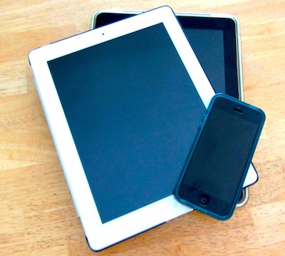
Maybe optimizing your website for mobile devices isn’t first on your to-do list, but if you want to make the most of your online presence and don’t want to lose potential newsletter subscribers and supporters, it’s necessary to make sure your mobile visitors can easily access your site with ‘responsive’ web design.
Maybe you have already optimized other parts of your website; making sure your website also displays well on mobile devices is another way to optimize your web presence.
Going through this list will take some time (like optimizing your email signup boxes), but it will be very well worth it in terms of website visitor satisfaction which turns to higher email sign ups which will consequently result in an improved bottom line.
1. How Many People Visit Your Website from a Mobile Device?
Do you know how many visitors come to your website from a smartphone or tablet? You can find the information within an analytics program. If you work with a webmaster, they will be able to give you this information if you already have an analytics program installed on your website.
If you don’t have one installed yet, try Google Analytics, which is excellent, free and easy to install. Be sure to set it up so the visits from you and others working for your organization are excluded. (If you’d like to know how to do this please ask in the comments.)
Once you have analytics information accumulated for a few weeks you’ll have a very good idea of how many people connect to your website via mobile devices.
Even though numbers differ depending on what statistics you’re looking at, currently overall approximately half of all internet visits originate from a mobile device such as a smartphone or tablet. And even though larger tablets like the iPad usually display websites correctly, smaller devices like smartphones might require a modified design to make sure all the information is available and legible.
2. Check Your Website for Functionality and Looks on Different Mobile Devices
The best way to find out how well your website works on mobile devices is to test it. Take the time to look at your website on all the popular devices to see how it functions and looks. First, check on devices already available to you like your smartphone or tablet.
To test your website on even more mobile devices go to any store that lets you try out devices and visit your website. Keep in mind, that you probably won’t need all the links and features to show on a small screen that are great to show on a large desktop screen. It’s OK to eliminate some links, graphics etc. for the sake of clarity.
Check for the following and take notes for each device. As you’re taking notes, keep it simple: Start with the absolute “must-haves” (for example if the Donate button doesn’t show or an important link doesn’t work) for smartphones and tablets and list any minor details separately. Keep in mind that any major design flaws will probably make your website less trustworthy to a visitor.
Important: A simple design that functions well with easy navigation will not only eliminate frustration by the visitor, it will also serve to make your website appear to be more trustworthy, even if it doesn’t have all the bells and whistles.
On to your checklist:
– Top header graphic: Does it show? Is it distorted?
– Font size: Is the font size appropriate for a mobile device or is it too small or too big?
– Top navigation bar below the header: Do all the links show? Do they work? Are they distorted? If you’re checking your site on a small smartphone screen, are those links across the top even necessary? (We took ours off on our homepage for mobile.)
– Does your website have a sidebar? Does it show? What happens to it on a smart phone? Do you really need it to show on a smartphone?
– Check all your “Donate” buttons: Do they actually work and take the visitor to a page or a service that let’s them donate?
– Is the donate page clear and uncluttered? All you want for your visitors at this point is to go through with their donation and Not watch the latest video from your recent event…
– Look for the “About” link: Make sure it works and leads the visitor to a page that’s legible.
– Contact page or form: Make sure it displays clearly and is uncluttered.
3. Make Changes to Your Website
If you’re working with a company that takes care of your website, you can talk to them about your list of changes and about responsive design. Responsive design simply means that your page will automatically adjust to the user’s screen size. You can also opt for a simpler adaptive design that only offers two sizes, like desktop/laptop size screens and mobile screens.
You can set up your website anyway you like with the same or different information showing depending on screen size.
If your website runs on an open and well-supported platform like WordPress it might be enough to simply install a plug-in that will automatically optimize your website for mobile devices. There are plug-ins that let you easily customize your mobile pages. A popular mobile plugin is WPTouch.
Of course, you may decide to get a whole new theme or design instead, with the mobile responsive functionality already integrated.

