As you surely know, fundraising in 2020 has been a wild ride for nonprofits of all shapes and sizes. Now, as GivingTuesday approaches, fundraising professionals such as yourself are working overtime to ensure their campaigns are ready to bring in as much revenue as possible when the big day arrives.
GivingTuesday is an annual fundraising tradition that falls on the Tuesday immediately following Thanksgiving each year. That means this year it will take place on December 1, 2020—making this the perfect time to get started preparing your campaign.
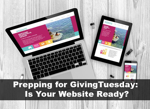
Now, in the midst of all of this year’s challenges, it’s more important than ever to have a strategically designed website with all the benefits it can bring for your organization.
We have put together this guide to help you get your website up to speed heading into the year-end season. Use these items as a checklist to ensure you have all the tools that you need to bring in maximum fundraising revenue come GivingTuesday. Ready to learn more about each one? Let’s get started!

1. Online Donation Page
An optimized online donation page should be the foundation for any fundraising strategy—both Giving Tuesday-related and otherwise. In fact, Giving Tuesday generated more than $500 million in total online donations in the U.S. in 2019 alone.
There are two major strategies when it comes to crafting the perfect online donation page, each with its own unique benefits and drawbacks. These are:
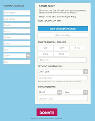
- Single-page donation forms: Single page forms are most likely what you picture when you think of a donation page. This is a basic page on your website which includes fields such as donor name, contact information, and payment information. The donor simply completes the form from top to bottom and confirms their submission at the bottom of the page. Here’s an example of one of these pages:

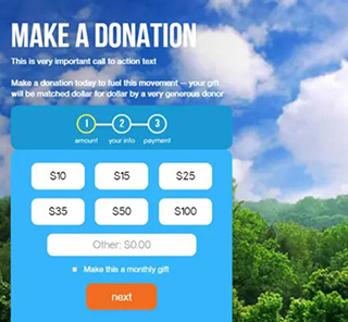
- Multi-step donation pages: In some cases, organizations are now also turning to multi-step donation pages. For this type of form, there will be just one or two questions per page, with a “next” button toward the bottom. These are popular among fundraisers because by spreading out the required fields among multiple steps, it can feel less overwhelming to donors. Take a look at this multi-step donation form:

Regardless of the type you choose to employ, many of the same best practices can be applied. For instance, keep the donation process short and sweet and avoid too many hurdles or hoops that the donor must jump through, especially if you’re taking a multi-step approach. In fact, many fundraising experts refer to the most successful donation pages as having a “minimalist design.” Keep this in mind as you begin to build or adjust your own online donation pages!
2. Mobile Optimization
Today, we live in a world that is dominated by smartphones as a source of communication, entertainment, and even research. In fact, studies show that more than 50% of all nonprofit website traffic comes from mobile devices.
That means that if your nonprofit website isn’t already optimized for mobile usage, you’re likely missing out on a substantial chunk of potential fundraising revenue. And leading up to a significant giving day like Giving Tuesday, you’ll want to make sure you’re all set to receive any donation that wants to come your way.
With most CMSs (especially nonprofit-specific ones), your website is likely already compatible with mobile. However, it’s a good idea to double-check things like images, other visual elements, and donation forms, to ensure your content is automatically restructured to fit any screen size—without endless horizontal scrolling and zooming.
It’s not just important that your site is mobile-responsive, but how users navigate on the mobile version of your website. Be sure to also review sidebars, captions, and callouts that are used on your website. If a lengthy sidebar stacks above your donation form or the main content of the pages, users might get frustrated and close their mobile browser.
Cleaner, mobile-optimized design will result in a website that’s more accessible in general, on both smartphones and desktops, ensuring everyone who visits your site this year-end season can enjoy a streamlined experience.
Also read: Checklist: Make the Most of Giving Tuesday
3. Matching Gift Tool
Matching gifts are an under-utilized source of fundraising revenue that most nonprofit organizations can benefit from. However, many fundraising teams lack a specific matching gift strategy to help them bring in this “bonus funding.”
Here are some mind-blowing matching gift statistics from Double the Donation that should help you understand the importance of leveraging corporate giving programs in relation to your Giving Tuesday campaign.
Did you know that:
- An estimated $4-7 billion in matching gift revenue is left on the table each year.
- 84% of individuals polled report a higher likelihood of giving if a donation match is offered.
- 1 in 3 donors indicates that they would make a larger gift if they know it’s being matched by their employer.
An embeddable matching gift database and easy-to-use employer search tool allow donors and prospects to quickly determine whether their gift would be eligible for a corporate match. Even better, this can all be completed without ever having to leave your website.
Adding a small explanation and embedded search tool on your Ways to Give page is an easy way to potentially boost the impact of your increased year-end donation volume.
4. High-Impact Content
Including high-impact content on your website is a crucial part of building and developing donor relationships. Whether they’re visiting your site for the first time on Giving Tuesday or they’ve spent a good amount of time browsing your content in the past, it’s important that you give your supporters something valuable to look at.
Let’s walk through a few tips for ensuring you create and promote the best content possible:
- Tell a specific story. Supporters want to hear about how their money is being used to further your mission. For example, if you work for a community animal shelter or a related charity, it’s a good idea to tell a specific story to garner interest and support. Did Fido find his forever home thanks to generous donors funding the shelter? Share that anecdote!
- Make the donor the hero. Your donors don’t want to hear about how YOU save puppies that need homes. They want to hear about how THEY save puppies. The donor should always be the hero of the story. A good practice is to ensure that your fundraising appeals throughout your website include more “you’s” than “I’s” or “we’s.”
- Include relevant visual aids. You know that a picture is worth a thousand words, which is why it’s a good idea to incorporate high-quality images throughout your web content. If you’re telling a story about how you build a new shelter for homeless dogs, be sure to include a photo or two of the dogs that benefited! And remember, your own photos and videos are much more impactful than generic stock photos.
When donors feel a real connection with your online content, they’ll be more likely to continue their engagement past a one-time donation on Giving Tuesday. In fact, they might even join your email newsletter or another recurring resource to continuously receive your high-quality content.
5. Visually Appealing Design
Of course, there are broader aspects of your website’s design that you don’t want to overlook. While ensuring valuable content is the meat and potatoes of your website, it’s important to make sure it’s presented nicely as well.
Here are a few best practices to consider when designing the visual elements of your site:
- Prominently display your logo. Your logo is one of your most important marketing materials. When used strategically, it should encourage donors and other site visitors to form subconscious connections to your brand. Be sure to include it on your website where it can be easily viewed!
- Ensure consistent branding. Speaking of branding, make sure you maintain consistent elements throughout both your site and your external marketing materials, including a basic color scheme, fonts, and imagery.
- Utilize blank space strategically. You’ll want to avoid filling every inch of your website with content, whether it’s text or visual elements. Too much crowding can take away from the most important pieces of your website, so be sure to leave a good amount of space open.
- Prominent and Strategic Calls to Action. The most important part of fundraising is asking. Make sure you have prominent and strategically placed calls to action throughout your website and not just on the homepage. Look at other top landing pages for your site, including blog posts, and make sure there are clear calls to action that will encourage visitors to donate.
A poor visual design can lead to site abandonment and negative user experience, reducing engagement (and therefore donations) during periods of high traffic like Giving Tuesday. The best way to avoid that is by providing a seamless and strategically crafted nonprofit website.
Also read: 5 Effective Year-End Fundraising Strategies
6. Easy-to-use Navigation
It doesn’t matter how good your fundraising strategy is if your supporters are unable to locate your online donation form on your website! That’s where having a user-friendly navigation system comes into play.
It’s a good idea to include a simple menu at the top of your website with buttons leading to some of your most important and highly-trafficked pages. However, including too many pages in your menu can become overwhelming and make the key pages harder to find.
For example, leading up to Giving Tuesday, you’ll want to prominently display a button linking to your Giving Tuesday fundraising page at the top of your nonprofit’s website. This should be separate from your typical “donate now” button that should remain on your site throughout the year.
This way, supporters know exactly which campaign they’re contributing to and can easily locate the one they’d like to support.
Each of these elements brings with it a valuable addition to your website at any time, but they can be especially useful as you begin to expect a big surge in giving. If you’re unsure of how to proceed or want to see more examples, be sure to check out Cornershop Creative’s list of the best nonprofit websites to garner inspiration from and see these tactics in action.
By making use of these tried-and-true tips and best practices, you’re able to set your organization up for a successful Giving Tuesday—as well as the launch of your year-end giving season. Good luck!
——-
About the Author:
With 15 years’ experience, Ira Horowitz is an expert in nonprofit online communications and online fundraising. His work at Cornershop Creative has resulted in increased funds and resounding supporter engagement for hundreds of organizations.
Ira oversees our project management team and works with clients to provide them with the best possible final product. He also manages all of our strategic engagements and helps guide nonprofits to determine their long-term strategic goals for online communications.

